Every year, thousands of patients in U.S. hospitals are harmed because a nurse grabs the wrong pill, a pharmacist fills the wrong script, or a doctor writes a name that looks too much like another. It’s not a rare mistake. It’s a quiet, systemic problem - and tall-man lettering is one of the simplest tools we have to stop it.
What Tall-Man Lettering Actually Does
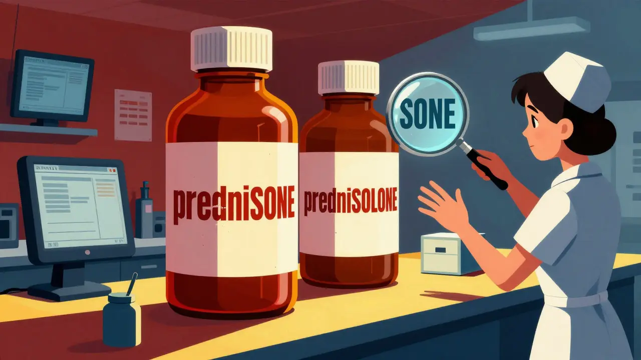
Tall-man lettering isn’t fancy design. It’s not about making drug names look cool. It’s about making them impossible to confuse. Take prednisone and prednisolone. They sound nearly identical. In a busy ER, under pressure, a nurse might grab the wrong one. But when you write it as predniSONE and predniSOLONE, your eyes catch the difference instantly. The capitalized letters - SONE vs. SOLONE - jump out. That’s the whole point. This technique uses selective capitalization to highlight the parts of drug names that differ. It’s not random. The FDA and the Institute for Safe Medication Practices (ISMP) have studied thousands of look-alike, sound-alike (LASA) drug pairs and decided exactly where to capitalize. For example:- vinBLAStine vs. vinCRIStine
- CISplatin vs. CARBOplatin
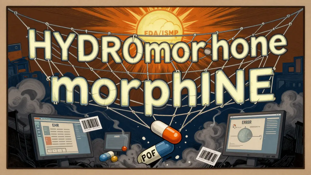
- HYDROmorphone vs. morphINE
- ALPRAZolam vs. LORazepam
Where You’ll See It - And Where You Won’t
You’ll find tall-man lettering in almost every modern hospital system in the U.S. It’s built into:- Electronic health records (EHRs) like Epic and Cerner
- Automated dispensing cabinets (Pyxis machines)
- Barcodes on medication labels
- Prescription printouts and pharmacy computer screens
Why It Works - And When It Doesn’t
The science behind tall-man lettering is solid. A 2004 ISMP eye-tracking study showed a 35% drop in selection errors when providers used tall-man lettering versus standard lowercase names. In real-world settings, hospitals that implemented it fully saw up to a 42% reduction in overridden alerts for LASA drugs. But it’s not magic. It doesn’t fix everything. If two drugs start with the same letters - like metoprolol and methyldopa - tall-man lettering won’t help much. The difference is at the beginning, where people don’t expect it. Capitalizing the end of the word doesn’t catch the eye if the mistake happens before you even get there. Also, some systems don’t implement it right. A 2016 study in Pediatrics claimed tall-man lettering didn’t reduce errors. But when researchers checked, many hospitals hadn’t even turned it on. The tool was there - but unused. And then there’s font size. One ER doctor on Reddit said he keeps mixing up ALPRAZolam and LORazepam because the capitalized letters are too small on his screen. If the system doesn’t use bold, larger fonts for the capitalized parts, the visual cue disappears.
How Hospitals Actually Implement It
Implementing tall-man lettering isn’t just clicking a button. It’s a project. A 2022 study in Pharmacology Research & Perspectives broke it down into five phases:- Form a team - Pharmacists, IT staff, nurses, and safety officers meet for 3+ weeks to decide which drugs need changes.
- Choose the systems - Which software? Which printers? Which dispensing machines? All must be updated.
- Set the rules - Do you follow FDA? ISMP? Australia? Most U.S. hospitals use ISMP’s list - it’s more detailed, with 252 drug pairs vs. FDA’s 72.
- Roll it out - This takes about two months. IT teams update databases, reprogram screens, test barcodes.
- Monitor and fix - After launch, staff report mismatches. A drug might show up wrong in one module. Adjustments are made.
The Bigger Picture: It’s Just One Layer
Tall-man lettering isn’t the solution. It’s part of the solution. Dr. Michael Cohen, president of ISMP, calls it “one essential layer in our defense-in-depth approach.” That means it works best when stacked with other tools:- Barcode scanning - scans the drug and patient wristband to match them
- Independent double-checks - two people verify high-risk drugs
- Forcing functions - EHRs that won’t let you submit a prescription without selecting the correct drug
What’s Changing Now
The good news? Things are getting better. In January 2023, the FDA and ISMP announced they were working together to unify their tall-man lettering lists. The first combined list is expected in mid-2024. That’s huge. Right now, hospitals don’t know which standard to follow. A unified list means consistency across the country. Australia just added 12 new drug pairs to its list in March 2023 after 78 near-misses were reported. The U.S. is doing the same - tracking incidents, updating lists quarterly. Even more promising: Epic Systems is testing AI that learns from real-time error data. If a nurse keeps selecting HYDROmorphone instead of morphINE, the system automatically makes the capitalization more obvious - bigger letters, brighter color. Early results show a 29% better reduction in errors than standard tall-man lettering.What You Can Do - Even If You’re Not a Pharmacist
You don’t need to be in healthcare to help. If you’re a patient:- Always ask: “Is this the right medication?”
- Compare the name on the bottle to the one your doctor gave you.
- If it looks like another drug you’ve taken before - speak up.
- Check if your EHR uses tall-man lettering consistently.
- Report mismatches - if your system shows fluoxetine but another shows FLUoxetine, flag it.
- Use it yourself. Don’t just rely on the system. Train your eyes to look for the capitalized parts.
The Bottom Line
Tall-man lettering isn’t perfect. It won’t stop every error. But it’s cheap, simple, and proven to work - when done right. In a world full of complex, expensive tech solutions, it’s one of the few tools that actually works without needing a new device, a new app, or a new policy. All it needs is a few capital letters - and the discipline to use them everywhere. The next time you see a drug name with weird capitalization - don’t think it’s a glitch. Think of it as a safety net. And if you’re part of a hospital system that hasn’t turned it on yet - ask why.What is tall-man lettering?
Tall-man lettering is a visual technique that uses selective capitalization in drug names to highlight differences between look-alike, sound-alike (LASA) medications. For example, writing "predniSONE" instead of "prednisone" helps prevent confusion with "predniSOLONE." It’s used in hospitals, pharmacies, and electronic health records to reduce medication errors.
Who decides which drug names get tall-man lettering?
The U.S. Food and Drug Administration (FDA) and the Institute for Safe Medication Practices (ISMP) both maintain lists of drug pairs that need tall-man lettering. The FDA has 72 recommended pairs, while ISMP’s list includes 252. Most U.S. hospitals follow ISMP’s more detailed list. In 2023, the FDA and ISMP began working together to unify their lists into one national standard.
Does tall-man lettering actually reduce errors?
Yes - but only when implemented correctly. Studies show a 35% reduction in selection errors in controlled settings, and real-world hospitals report up to a 42% drop in alert overrides for LASA drugs. However, if the system doesn’t apply it consistently across all platforms (EHRs, dispensing machines, labels), it can cause confusion instead of preventing it.
Why do some hospitals still have problems with tall-man lettering?
The biggest issue is inconsistency. One system might use "FLUoxetine" while another uses "fluoxetine." Community pharmacies often don’t follow hospital standards. Legacy software, poor font choices, and lack of staff training also contribute. A 2023 survey found 63% of pharmacists reported conflicting tall-man lettering across systems in their own hospital.
Is tall-man lettering enough to prevent medication errors?
No. It’s one layer in a defense-in-depth strategy. It works best when combined with barcode scanning, independent double-checks, and forcing functions in electronic prescribing systems. Experts agree it’s necessary but not sufficient on its own. The American Society of Health-System Pharmacists gives it a Grade B recommendation - helpful, but not a standalone fix.
What’s new in tall-man lettering in 2026?
The FDA and ISMP are finalizing their first unified tall-man lettering list, expected in early 2024. Some hospitals are now using AI-powered systems that adjust capitalization in real time based on user error patterns - showing a 29% greater reduction in mistakes than traditional methods. Australia and the U.S. continue to update their lists quarterly based on new near-miss reports.


